via IPS News

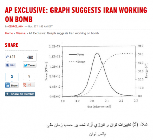
Graph published by the Associated Press on Nov. 27, 2012, reportedly as evidence of Iranian computer modeling of nuclear weapons yields.
The suspect graph of a nuclear explosion reportedly provided to the International Atomic Energy Agency (IAEA) as evidence of Iranian computer modeling of nuclear weapons yields appears to have been adapted from a very similar graph in a scholarly journal article published in January 2009 and available on the internet.
The graph, published in a Nov. 27 Associated Press story but immediately found to have a mathematical error of four orders of magnitude, closely resembles a graph accompanying a scholarly article modeling a nuclear explosion. It provides a plausible explanation for the origins of the graph leaked to AP, according to two nuclear physicists following the issue closely.
The graph in the scholarly journal article was well known to the IAEA at the time of its publication, according to a knowledgeable source.
That means that the IAEA should have been able to make the connection between the set of graphs alleged to have been used by Iran to calculate yields from nuclear explosions that the agency obtained in 2011 and the very similar graph available on the internet.
The IAEA did not identify the member countries that provided the intelligence about the alleged Iran studies. However, Israel provided most of the intelligence cited by the IAEA in its 2011 report, and Israeli intelligence has been the source of a number of leaks to the AP reporter in Vienna, George Jahn.
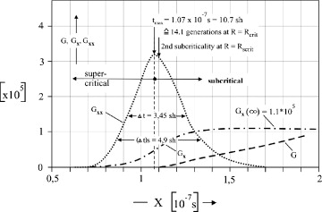
The graph accompanying an article in the January 2009 issue of the journal Nuclear Engineering and Design by retired Swiss nuclear engineer Walter Seifritz displayed a curve representing power in a nuclear explosion over fractions of a second that is very close to the one shown in the graph published by AP and attributed by the officials leaking it to an Iranian scientist.
Both graphs depict a nuclear explosion as an asymmetrical bell curve in which the right side of the curve is more elongated than the left side. Although both graphs are too crudely drawn to allow precise measurement, it appears that the difference between the two sides of the curve on the two graphs is very close to the same in both graphs.
The AP graph appears to show a total energy production of 50 kilotonnes taking place over about 0.3 microseconds, whereas the Seifritz graph shows a total of roughly 18 kilotonnes produced over about 0.1 microseconds.
The resemblance is so dramatic that two nuclear specialists who compared the graphs at the request of IPS consider it very plausible that the graph leaked to AP as part of an Iranian secret nuclear weapons research programme may well have been derived from the one in the journal article.
Scott Kemp, an assistant professor of nuclear science and engineering at the Massachusetts Institute of Technology (MIT), told IPS he suspects the graph leaked to AP was “adapted from the open literature”. He said he believes the authors of that graph “were told they ought to look into the literature and found that paper, copied (the graph) and made their own plot from it.”
Yousaf Butt, a nuclear scientist at the Monterey Institute, who had spotted the enormous error in the graph published by AP, along with his colleague Ferenc Dalnoki-Veress, said in an interview with IPS that a relationship between the two graphs is quite plausible, particularly given the fact they both have similar asymmetries in the power curve.
“Someone may just have taken the Seifritz graph and crudely adapted it to a 50-kilotonne yield instead of the 18 kilotonnes in the paper,” Butt said.
He added that “it’s not even necessary that an actual computer model was even run in the production of the AP graph.”
Apparently anticipating that the Seifriz graph would soon be discovered, the source of the graph given to AP is quoted in a Dec. 1 story as acknowledging that “similar graphs can be found in textbooks, the internet and other public sources.”
Butt said that he doesn’t know whether the AP graph is genuine or not, but that it could well be a forgery.
“If one wanted to plant a forgery,” he wrote, “it would make sense to manufacture something that looked like the output from the many unclassified ‘toy-models’ available on-line or in academic journals, rather than leak something from an actual high-fidelity classified study.”
The Seifritz graph came to the attention of the IAEA secretariat soon after it was published and was referred to the staff specialist on nuclear weapons research, according to a source familiar with the IAEA’s handling of such issues.
The source, who refused to be identified, told IPS the reaction of the official was that the graph represented fairly crude work on basic theory and was therefore not of concern to the agency.
The agency was given the alleged Iranian graph in 2011, and a “senior diplomat” from a different country from the source of the graph said IAEA investigators realised the diagramme was flawed shortly after they received it, according to the Dec. 1 AP story.
The IAEA’s familiarity with the Seifritz graph, two years before it was given graphs that bore a close resemblance to it and which the agency knew contained a huge mathematical error, raise new questions about how the IAEA could have regarded the Israeli intelligence as credible evidence of Iranian work on nuclear weapons.
Yukiya Amano, the director-general of the IAEA, refused to confirm or deny in an appearance at the Council on Foreign Relations in Washington Dec. 6 that the graph published by AP was part of the evidence of Iranian “activities” related to nuclear weapons cited by the agency in its November 2011 report. .
Amano responded to a question on the graph, “I can’t discuss this specific information.”
In its November 2011 report, the IAEA said it had “information” from two member states that Iran had conducted “modeling studies” aimed at determining the “nuclear explosive yield” associated with components of nuclear weapon. It said the “information” had identified “models said to have been used in those studies and the results of these calculations, which the Agency has seen”.
The “senior diplomat” quoted by AP said the IAEA also had a spreadsheet containing the data needed to produce the same yield as shown on the graph – 50 kilotonnes – suggesting that the spreadsheet is closely related to the graph.
Butt observed, however, that the existence of the spreadsheet with data showing the yield related to a 50 kilotonne explosion does not make the graph any more credible, because the spreadsheet could have been created by simply plugging the data used to produce the graph.
Kemp of MIT agreed with Butt’s assessment. “If it’s simply data points plotted in the graph, it means nothing,” he told IPS.
After Butt and Dalnoki-Veress identified the fundamental error in the graph AP had published as evidence of Iranian work on a 50-kilotonne bomb, the Israeli source of the graph and an unidentified “senior diplomat” argued that the error must have been intentionally made by the Iranian scientist who they alleged had produced the graph.
A “senior diplomat” told AP the IAEA believed the scientist had changed the units of energy used by orders of magnitude, because “Nobody would have understood the original….”
That explanation was embraced by David Albright, who has served as unofficial IAEA spokesman in Washington on several occasions. But neither Albright nor the unidentified officials quoted by Jahn offered any explanation as to why an accurate graph would have been more difficult for Iranian officials to understand than one with such a huge mathematical error.
Further undermining the credibility of the explanation, Jahn’s sources suggested that the Iranian scientist whom they suspected of having devised the graph was Dr. Majid Shahriari, the nuclear scientist assassinated by the Israeli intelligence agency Mossad in 2010.
No evidence has been produced to indicate that Shahriari, who had a long record of publications relating to nuclear power plants and basic nuclear physics, had anything to do with nuclear weapons research.
*Gareth Porter, an investigative historian and journalist specialising in U.S. national security policy, received the UK-based Gellhorn Prize for journalism for 2011 for articles on the U.S. war in Afghanistan.


